You can also take a look at this post from one of my favorite blogs on what is and what is not a heat map.
Well for long time I wanted to give it a try and yesterday I had the time to experiment a bit. The idea was to display GBIF available data as a Heat Map over Google Maps. Here you have an screenshot for Quercus ilex:
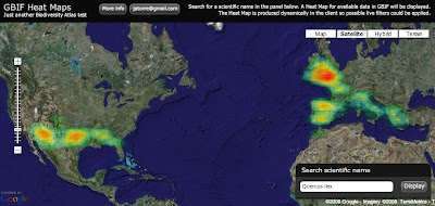
And if you want to try for yourself here it is (some usability issue, the search box is on the bottom right corner):
So how does it work? It was actually easier than I expected:
1) Get the data: I am using the so called "Density tables" from GBIF. You can access them through GBIF web services API at http://es.mirror.gbif.org/ws/rest/density . For example in a query like this one for Quercus ilex (of course you need to get the taxonconceptkey from a previous request to the services):
This works fine but has some problems. The first one is that GBIF goes down almost every evening. Tim can maybe explain why. Thats why I am using the spanish mirror (look at the url) and I recommend you to do the same.
Second problem is the verbosity of the XML schema being used. For downloading the Animalia, well thats the biggest concept you can get probably, the result is 14.1 MB of XML. And thats just to get a list of cellIds (if anybody is interested we can post details about CellIds) with counts on them, exactly an array of 34,871 numbers. Even worst is handling them on a web client like this one, parsing such a huge xml output kills the browser. The GBIF webservices API deserve its own blog post I would say together with Tim.
But what is new is that I have supercow powers on GBIF :D I am working for GBIF right now and have access to a test database. In a testing environment I developed a little server app that publish the same density service but using the AMF protocol. I used AMFPHP for this if anybody is interested. There are two good things about using AMF: The output now is around 150 KB for the same thing and AMF is natively supported by Flash so there is no need to be parsed it goes straight into memory as AS3 Objects.
2) Create a Het Map from the data: Once the data is on the client I make use of a Class from Jordi Boggiano called HeatMap.as that creates Sprites as the result. In my case I decided to create a Spring, think like an Image, of 1 pixel per cellId creating a 360x180 pixel image (cellId is equivalent to a 1 degree box).
3) Overlay the image on Google Maps: When you have the Sprite, or even earlier but thats too many details, what you do is overlaying in Google Maps for Flash using a GroundOverlay object that takes care of the reprojection and adapting it to the map. The GroundOverlay is explained in the doc as a way to overlay images but it accepts actually any Sprite.
Done! (almost)
4) Ok, there are some problems: Yes, it is not perfect, these are the pending issues:
- The GroundOverlay seems to not be reprojecting correctly the Sprite I generate and in the very north and south everything is not correctly overlayed.
- The resolution of the Heat Map is a little bit poor, bu actually represent the quality of the data we have. Some interpolation could be done to make it look nicer.
- The colours of the Heat Map do not fit well with the actual Google Maps layers. When there is small data then you can not see it almost.
I still dont feel confident with the code to release it yet. I hope I can work a little bit more on it so that i can be proud, but if you desperately need it let me know.
Just another notice. Yesterday Universal Mind released a preview of a new product: Spatial Key. I am always impressed with what this people does and follow the blogs from their developers (like this one and this one). They are kind of my RIA and web GIS heroes. The new product they have released actually look very much like what I wanted to do in Biodiversity Atlas for data anlysis. It lets people explore geographically and temporally huge datasets. Tim suggested me to contact them and I will do. Nevertheless it is great to have such a great tool available to get ideas on interaction design. Good job Universal Mind, you really rock.
We want to see your comments!
Update:
Some people asked for different quality settings on the heat map. I have modified the application so that you get now a set of controls to define different quality and drawing options. By default the app tries to figure out depending on the number of occurrences, but maybe thats not the best, depends on how the data is dsitributed. In a final product I think I would NOT provide this functionality to the user, too much for my taste. You know, less is more.
Update 2:
There is a following post with correctly reprojected data and source here.


6 comments:
What you have done looks really well. Would you be able to give some more details as I'd love to replicate it for something I'm working on
Im working right now in a more sophisticated version that will work on different zoom levels. It will also allow display of grids at different resolutions all client side. If you dont mind to wait a bit more I will publish soon a more complete app with source view enabled. If you are in a hurry you can mail me an i will send you the code of this example (jatorre [at] gmail.com)
Javier - This is a wonderful way to display distribution data! I have an observation and a question:
1) Nothing appears on the heatmap for a couple species in our area (e.g., Erythronium oregonum and Trillium ovatum). I'm assuming that there are not enough data to effectively generate a heat cloud? (If so, would it be possible to have the overlay show point distributions in such instances?)
2) I'm trying to find the code/technique for embedding a dynamically generated Google map with an overlay of a species distribution (like the Google satellite map on this page)
Your work, help and efforts are greatly appreciated.
Cheers,
-stk
Hi Scott,
Glad you like it.
1) The reason why you dont see anything on your area is probably because GBIF does not have data for it at the moment. But this tool is using a pretty old cache of the GBIF data so there might be new data now. In any case I agree that the tool should also overlay actual points so that people can actually see from what data the cloud is being generated. We are working on it, see next point.
2) First of all the map you show, and the heat map on this post is not actual distribution data, but just what i called primary data from GBIF. Primary data is just disperate points on where a species had been observed, but that does not imply that this is the actual distribution or range of this species. I think GBIF, and all biodiversity projects, are having some problems explaining the difference.
We are on the process of starting a new project call biodiversity atlas where we would try to work on species ditributions based from primary data and other sources together. The project will create widgets to easily embed this information in other pages. There is not much i can show right now but all i can say is that we are working on it.
Expect widgets like this one:
http://www.imastedev.com/eol/EOLSpeciesMap.html?taxon_id=13839800
Keep tune on the blog as more and more on this topic will be presented soon.
Javier.
Javier - Interesting link. Gave me several immdiate thoughts:
1) The reason I became interested at all is that I wanted to add an observation point for Trillium ovatum (had one in our 5-acre "yard", until a deer ate it), but reading the GBIF data-provider details made me realize that it's not really geared toward "the public". (Was going to blog about our Trillium and wanted to post an interactive distribution/observation map with the article).
2) I noticed that the number of observations for this species (in GBIF) are disappointingly few.
3) Adding observation data by "the public" opens up "data quality" issues. Still, I see a need for a data repository that makes adding observations a tad easier.
4) Would see value in overlaying a colored polygon of "known distribution area" on TOP of observed data (toggle, color & transparency controls)
5) Another component to consider: "observation time". Species distribution changes, either shrinking, migrating, appearing or (sadly) disappearing. Tracking observations over time may prove useful.
6) Every map should include a link to "more information" about the species being mapped + an on-map title of the species (+common name?). I had no idea what was being mapped on the map you linked. It took an internet search to realize it showed observations for the House Sparrow (Guess I don't know my taxon_id numbers very well!) ;)
This is all really cool stuff and I'll be eagerly staying tuned in!
Cheers,
-stk
www.randsco.com
It is cool you bring this topic. What you are asking for is a way for general public to contribute with their nature observations into a common biodiversity/species distribution project. I could not agree more.
In fact I am part of a new project that will eventually appear called specieslog. The idea there is to allow contributions like yours to global knowledge. But we are really in very early stages on this so I can not talk much about it yet :(
Regarding the inclusion the scientific name you are totally right! But the link I sent you is a widget that is embeded in a taxon page, and of course there you will see the name of the taxon + lot of more information.
Finally about observation time... this would be so cool... there are some problems with it although... most of the data do not include this info unfortunately. Then managing this temporal aspect really makes the processing muuuuuch more complicate :( So much that I desisted for the moment. But if you want to see a tool that is doing it right and that I like a lot check www.spatialkey.com
Cheers.
Post a Comment