Thursday, August 28, 2008

Google Maps HeatMap now correctly reprojected

I posted some weeks ago my first experiment on HeatMaps over Google Maps for Flash. It was well received by the community of google maps developers and several asked for the code. I did not published it ten because there were still some things I did not understand and somehow were just magic and I had to tweak. The biggest problem was that the heatmap actually was not correctly overlaying in the map, it was clearly a Projection problem. I was plotting the coordinates in an image without reprojecting them to the Mercator projection used by google Maps.

Ok, now I have solved this by using the GoogleMapUtility.php class in the server after getting the latitudes and longitudes of my points from the database.

The final result can be viewed here (source view enabled)


This is how the map would look like without reprojection:

And this is how it looks projected:

If you are overlaying a little heatmap over a small area, a city for example, you dont have to worry about reprojecting as there is not much difference. But like in this case, there is no other way.

The projection takes place on the server on this method:

public function getMercatorCoords() {
$conn = pg_connect($this->conn_string);
$query = "select latitude,longitude from my_table";
$result = pg_query($conn, $query);

$dataX = array();
$dataY = array();

while ($row = pg_fetch_row($result)) {
$lat = $row[0];
$lng = $row[1];
$po = GoogleMapUtility::toZoomedPixelCoords($lat,$lng,0);

$dataY[] = $po->y;
$dataX[] = $po->x;
}
$res = array();
$res["dataX"] = $dataX;
$res["dataY"] = $dataY;
return $res;
}
The GoogleMapUtility.php class can be found here. I am not sure who developed it but is widely available all over the web.

In this class I set the Tile Size to be 360, but it could had been more or less anything as long as in the Flex side then you use the same size for creating the Sprite (check the flex source code for more details).

What I would really like is to be able to do this reprojection on Flex as normally I just transfer coordinates to the client and then represent it in different ways, heatmap, grids, markers, etc.
I will try to port the GoogleMapUtility class soon to AS3 and publish it here.

I am using this code already in the widget I am developing for GBIF. It is only a small area and I dont have much data, but I am happy with it.


Wednesday, August 13, 2008

Google Chart API in GBIF Provider Software

Since I came across the Google Chart API I always wanted to try to use it for biodiversity data. And finally I have the chance to. Working on a new provider software for biodiversity data with GBIF, I am using Google Charts to give statistical overviews about the datasets being served.

This is what an overview currently looks like:


A major difference between this software and "classical" wrapper solutions in the biodiversity community, e.g. TapirLink or the BioCASE Provider Software, is to provide an extensible cache database which is specific for biodiversity datatypes. This allows to develop richer user interfaces and webservices and hopefully provide more value to end users, thereby reaching out to more data holders.

Initially the software is planned to work with occurrence/specimen data, taxonomic checklist data and general dataset descriptions using EML files. The software allows you to upload data from databases or files into the cache. Data in the cache can not be modified (other than removing/replacing the entire dataset), so during the upload the data can be analyzed and enhanced. For example UUIDs are assigned if no GUID existed already and records are compared to previously existing records, thereby detecting if a record was modified, deleted or added (information needed for incremental harvesting, e.g. via OAI).  You can read more about the planned functionality on the project wiki (simple bullet points, no proper documentation I am afraid), or in subsequent posts when I will focus on different aspects of the evolving software.

I have been using gchartjava to create the URLs for the google charts, as they can become quite unwieldy if  you deal with more data. But in general it is very nice to work with the API. It is fast enough to answer dynamically generated URLs and the semi-automatic layout works pretty well. Even though this example here, number of specimens grouped by families, contains quite a lot of labels, it works well with an accompanying table.


But the best part of GCharts I think are the country maps. How many times did I want to visualise country based information? With GCharts this is dead easy. You can either assign a specific color to each ISO country (or US state within the US) or assign an integer to each country you want to mark and specify a gradient by defining the color for the max and the min value provided. So in the simplest case you can just pass the number of occurrences for each country. If that number is too large it is better to normalize it before though, because URL strings are limited in length.

Apart from a world map, Google also provides 6 different regional focuses, for example Asia, Europe or the Middle East. So far I am impressed!

Friday, August 8, 2008

GBIF data heat maps - Heat maps over Google Maps for Flash

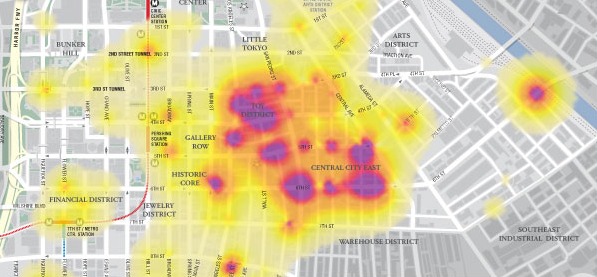
Maps like everything else seems to be trendy. And nowadays the sexy thing in mapping is the creation of Heat Maps. The best way to understand what they are is to see them:


You can also take a look at this post from one of my favorite blogs on what is and what is not a heat map.
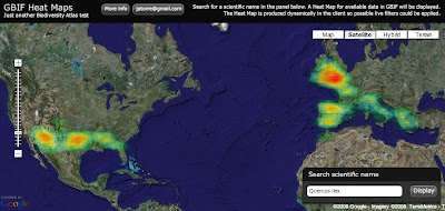
Well for long time I wanted to give it a try and yesterday I had the time to experiment a bit. The idea was to display GBIF available data as a Heat Map over Google Maps. Here you have an screenshot for Quercus ilex:

And if you want to try for yourself here it is (some usability issue, the search box is on the bottom right corner):


So how does it work? It was actually easier than I expected:

1) Get the data: I am using the so called "Density tables" from GBIF. You can access them through GBIF web services API at http://es.mirror.gbif.org/ws/rest/density . For example in a query like this one for Quercus ilex (of course you need to get the taxonconceptkey from a previous request to the services): 

This works fine but has some problems. The first one is that GBIF goes down almost every evening. Tim can maybe explain why. Thats why I am using the spanish mirror (look at the url) and I recommend you to do the same.
Second problem is the verbosity of the XML schema being used. For downloading the Animalia, well thats the biggest concept you can get probably, the result is 14.1 MB of XML. And thats just to get a list of cellIds (if anybody is interested we can post details about CellIds) with counts on them, exactly an array of 34,871 numbers. Even worst is handling them on a web client like this one, parsing such a huge xml output kills the browser. The GBIF webservices API deserve its own blog post I would say together with Tim.

But what is new is that I have supercow powers on GBIF :D I am working for GBIF right now and have access to a test database. In a testing environment I developed a little server app that publish the same density service but using the AMF protocol. I used AMFPHP for this if anybody is interested. There are two good things about using AMF: The output now is around 150 KB for the same thing and AMF is natively supported by Flash so there is no need to be parsed it goes straight into memory as AS3 Objects.

2) Create a Het Map from the data: Once the data is on the client I make use of a Class from Jordi Boggiano called HeatMap.as that creates Sprites as the result. In my case I decided to create a Spring, think like an Image, of 1 pixel per cellId creating a 360x180 pixel image (cellId is equivalent to a 1 degree box).

3) Overlay the image on Google Maps: When you have the Sprite, or even earlier but thats too many details, what you do is overlaying in Google Maps for Flash using a GroundOverlay object that takes care of the reprojection and adapting it to the map. The GroundOverlay is explained in the doc as a way to overlay images but it accepts actually any Sprite.

Done! (almost)

4) Ok, there are some problems: Yes, it is not perfect, these are the pending issues:
  • The GroundOverlay seems to not be reprojecting correctly the Sprite I generate and in the very north and south everything is not correctly overlayed.
  • The resolution of the Heat Map is a little bit poor, bu actually represent the quality of the data we have. Some interpolation could be done to make it look nicer.
  • The colours of the Heat Map do not fit well with the actual Google Maps layers. When there is small data then you can not see it almost.
I still dont feel confident with the code to release it yet. I hope I can work a little bit more on it so that i can be proud, but if you desperately need it let me know.

Just another notice. Yesterday Universal Mind released a preview of a new product: Spatial Key. I am always impressed with what this people does and follow the blogs from their developers (like this one and this one). They are kind of my RIA and web GIS heroes. The new product they have released actually look very much like what I wanted to do in Biodiversity Atlas for data anlysis. It lets people explore geographically and temporally huge datasets. Tim suggested me to contact them and I will do. Nevertheless it is great to have such a great tool available to get ideas on interaction design. Good job Universal Mind, you really rock.

We want to see your comments!

Update: 
Some people asked for different quality settings on the heat map. I have modified the application so that you get now a set of controls to define different quality and drawing options. By default the app tries to figure out depending on the number of occurrences, but maybe thats not the best, depends on how the data is dsitributed. In a final product I think I would NOT provide this functionality to the user, too much for my taste. You know, less is more.

Update 2:
There is a following post with correctly reprojected data and source here.


Thursday, August 7, 2008

WMS Overlays in Google Maps for Flash

While working on BiodiversityAtlas I thought on overlaying distributions using a Geoserver WMS server together with Google Maps for Flash. Well, actually I started working on Umap but then moved to Google Maps. At this moment there were no examples of overlaying WMS with this mapping engines so I worked on it. Now you can find a much better work than mine for Umap here, and in this post I do the same for Google Maps.

Here is the link to the demo with source code view enabled if you just want to see and get the code:

http://biodiversityatlas.com.s3.amazonaws.com/gmapwms/GoogleMapsWMSOverlay.html


Basically it extends Google TileLayerBase and in the loadTile method it generates a WMS Url request converting the x,y,z parameters of tiles to ESPG:900913 . This ESPG has been created to overlay WMS in Google maps so it is aware of the different projections of Google Maps at different zoom levels, so probably you get the best overlay possible.
The trickiest part of the class was converting the x,y,z parameters into coordinates because it involves some reprojection of coordinates that I never really undertood, but that is available from different Javascript Map clients.

Still the support of WMS in Google is quite poor because of the lack of a TileLayerOverlay class on the library. So right now you have to bind your overlay to one maptype and if the user changes it then it disappear. There are hacks to emulate all basic Google MapTypes toegther with the overlay but it is a very poor solution. If you change your MapType you dont want your Overlay to ge trefreshed too. But... hopefully it will be solved soon.

The other missing thing I see is the lack of a method to enforce a redraw of the overlay. In my case the WMS overlay requests include a filter in the URL. My WMS overlay is not static, it is a database of species data, so it only make sense to visualize it with a filter specifying which species you want to see. In the application I let the user choose a species and then I change dynamically the filter in the overlayed class. Of course then I need a refresh of the Overlay but there is no way to do it through the google library. Now I am using a hack as simple as changing 1 pixel the size of the map and therefore enforcing a refresh of the layers on the map. But this is not optimal for several reasons:
  1. Resizing the map is SLOOOOW and the performance is horrible.
  2. When the map refreshed it refreshes all layers, including the ones from google that I dont want to get refreshed, I only want mines to get refreshed! The result is an ugly effect for the user.
Additionally would be great if there is a way to get noticed on when tiles had finished being
loaded for a certain Layer. This would allow to display notifications to the user on when all the
data is ready on the map. In the case of Google Tiles it is pretty obvious for the user when the
data has been loaded. You see the map or not. But in custom TileLayers with little information
on them that overlay over the map, it can be hard for the user to notice if he is seeing all the
data coming from the server.

Hey but I am very happy in general with the Google Maps for Flash API, these guys are doing a great job and Pamela Fox (Google Employee) is very nice on the mailing list solving questions. I just wish Google would spend a little bit more resources so we get new features quicker :)

I still haven't talked about how I solved drawing thousands of polygons efficiently on the map dynamically from user input and lot of curious stuff I am doing for the BiodiversityAtlas Editor. Other thing I am working is on Heat Maps, this should be finished by the end of the week :) Keep tune!

Sunday, August 3, 2008

Nice JSON backed flash charts


There is a nice flash charts implementation, that is backed by JSON calls (here) - ideal for a non flashy, backend java person like me. I plan to use it to produce some summary visualisations on datasets so you can discover what you have before downloading 22Million records or so. Combined with some simple mapping views, I aim to do summaries like (these are just some first thoughts and not properly thought through):

- taxonomic + basis of reference matrix (observations of animals, versus specimens of plants etc)
- temporal coverage by taxa (give an idea of what names might have been used during identification)
- X-referenced with mutliple taxonomies (e.g. Catalogue of Life 2008 covers 50% plants, 75% animals in results)
- occurrence density maps
- taxa "distribution" maps - based on raw points. with BiodiversityAtlas, could overlay real distributions and points
- Protected area coverage (records in protected areas, % of result geospatial scope that is considered protected and which category)

This would all sit on top of data that is mined using hadoop. More to follow as this idea develops...